In January 2017, I received an email from Simone with the subject line “doltish amateur.” For a moment my brain spasmed: was this a stark judgment of my abilities as a designer? I had just been freelancing for a year, so who knows….
It turned out to be a false alarm, of course: this was just humor with self-deprecation. I opened the email, in which she asked me if I could help with a new logo for Kehidupan Anda. She had created a concept in Photoshop, and she was curious if I could give it a push in the right direction.
I felt directly involved in the process. For me, developing a new logo and logotype is one of the most enjoyable aspects of graphic design, especially when it involves an organization with a clear mission.
As can be seen, I didn’t change much about that first concept: the fishing child in the boat remained. A slightly warmer orange was supported by blue waves of the sea. The board was satisfied and business cards were printed to hand out: the new logo made the rounds at Divevaker in 2017 and 2018.
And yet something gnawed…
The more often I looked at the concept, the more problems I had with the fishing child. In fact, the Kehidupan Anda Foundation works closely with Simone (a PADI Course Director) to train children to become divers so they can work as dive guides.
This did not square with the image of angling fish out of the water, especially since divers are always taught to be respectful of the environment. Leave nothing but bubbles, take nothing but pictures.
A fresh relaunch
At a quiet moment, I decided to make another attempt, but this time the change had to be radical. I let go of the old concept and focused on simple, abstract and recognizable.
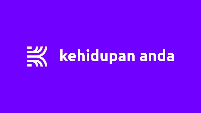
After some experimentation, this became the final result:
In the concept we see an abstract letter K, an unfolded book, and the flared curves may represent new directions or self-development. The violet color scheme makes it fresh and effective. We also see this color subtly incorporated here on the website, such as buttons and links.
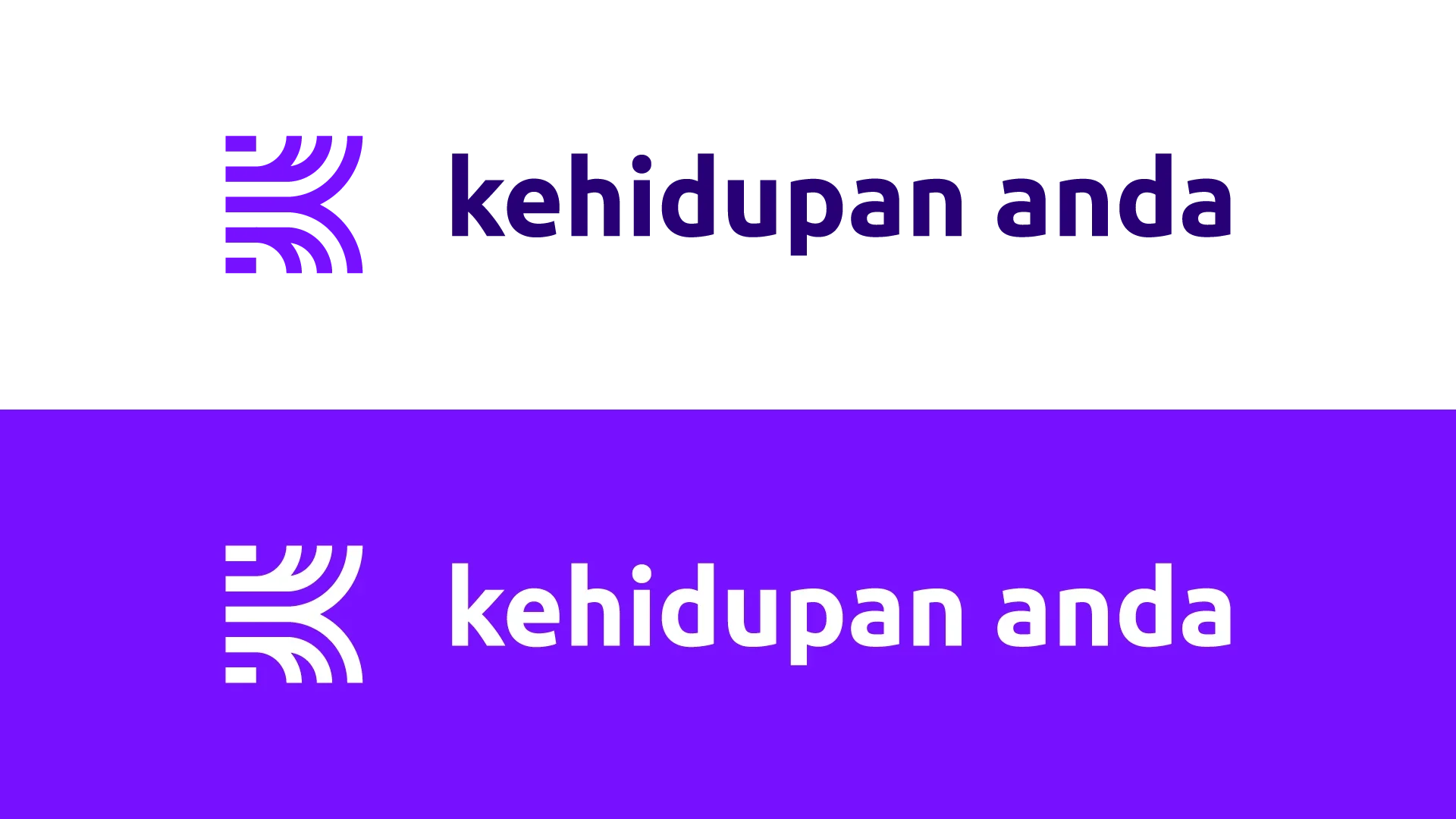
The symbol can also be used separately as a social media profile:
The result is a modern logo that stands the test of time, and gives the foundation a strong identity.

